Analyzing COVID-19 Data with SPARQL

For those of us living in the US, increasing COVID-19 case numbers across the country is unfortunately at the top of our minds. We do not lack access to data or infographics about the pandemic but having access to raw data and writing queries yourself can still give you different insights or at least get you better at writing queries. For this reason, we decided to turn the open-source COVID-19 dataset published by New York Times into RDF and included it in our publicly accessible Stardog Sandbox environment. In this post, we will talk about the details of this dataset, sample SPARQL queries we have written against this graph and how connecting graphs can reveal new information.
About the dataset
The NYT dataset is as simple as it gets: It is a single CSV file with 5 fields:
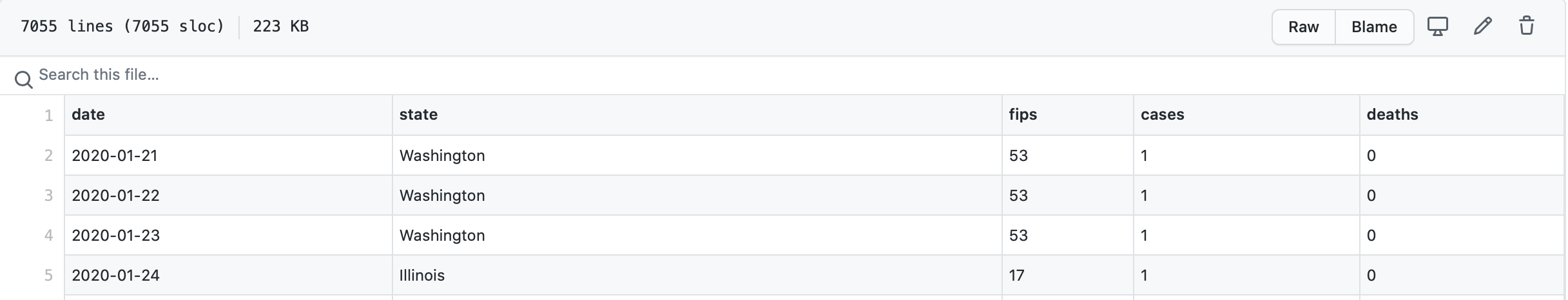
Each row is the daily report for a US county showing the cumulative number of COVID-19 cases and deaths at that date as compiled by NYT. We mapped this data to a simple graph model:
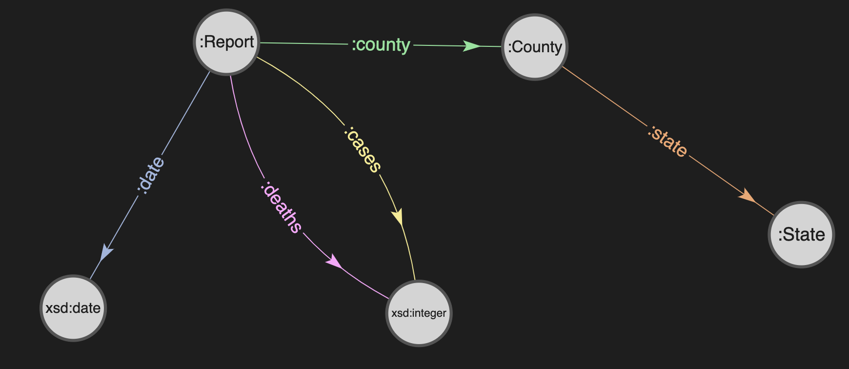
So each daily report becomes a node in the graph and connected to the county which is connected to the state.
Exploring the graph
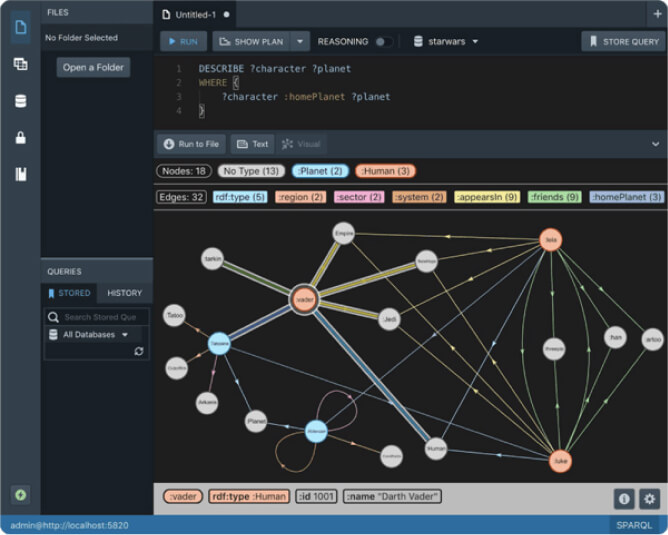
To use the COVID-19 dataset in Stardog Sandbox simply open the Stardog Studio in your browser — don’t forget to complete the welcome tour if this is your first time using Studio — and click the “Connect to Stardog” button and choose “Stardog Sandbox”:
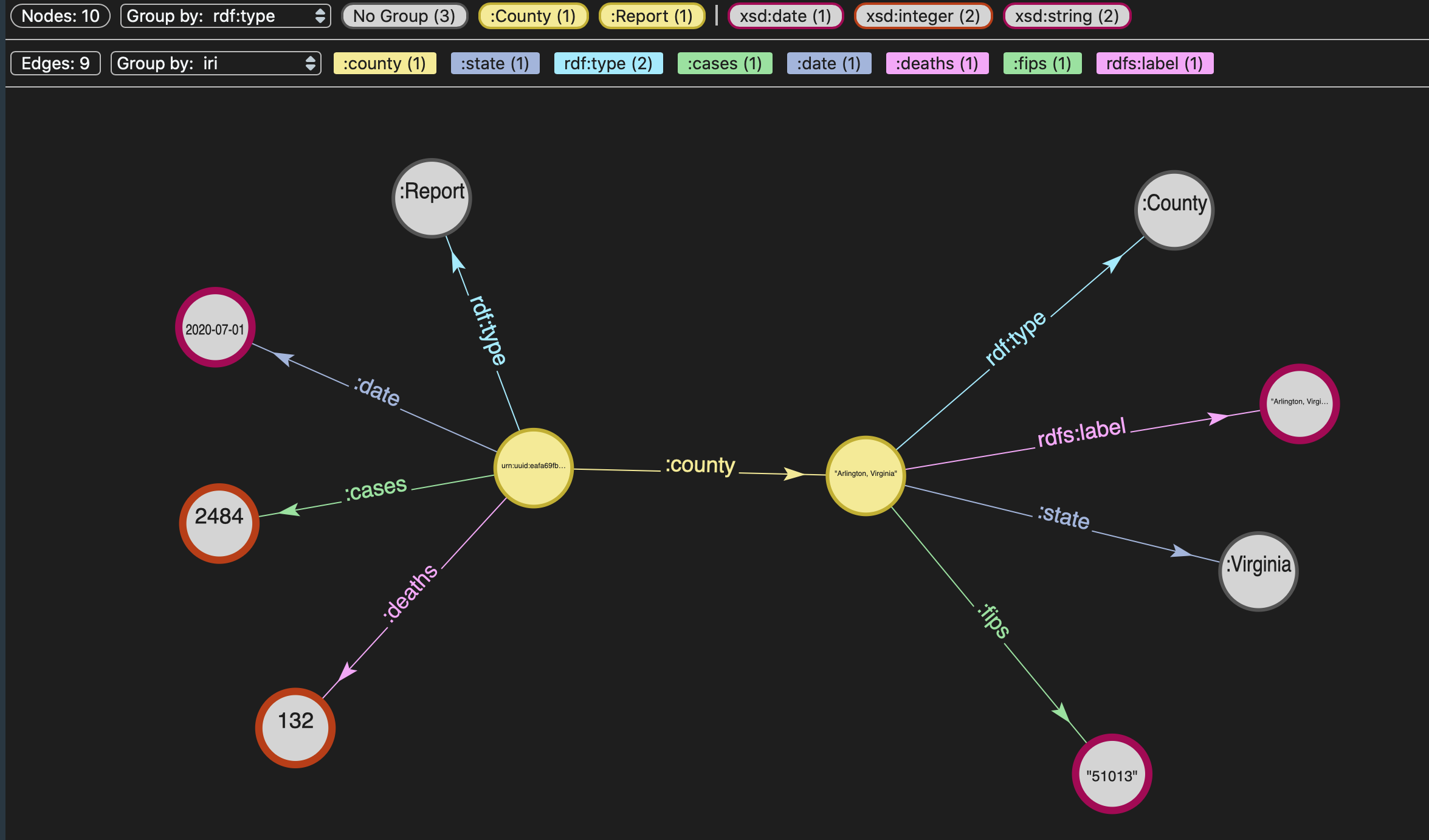
Once you are connected to the Sandbox, in Studio you can browse the graph visually (as seen above) or use the “Data Exploration” tab to explore the classes and instances in the graph:
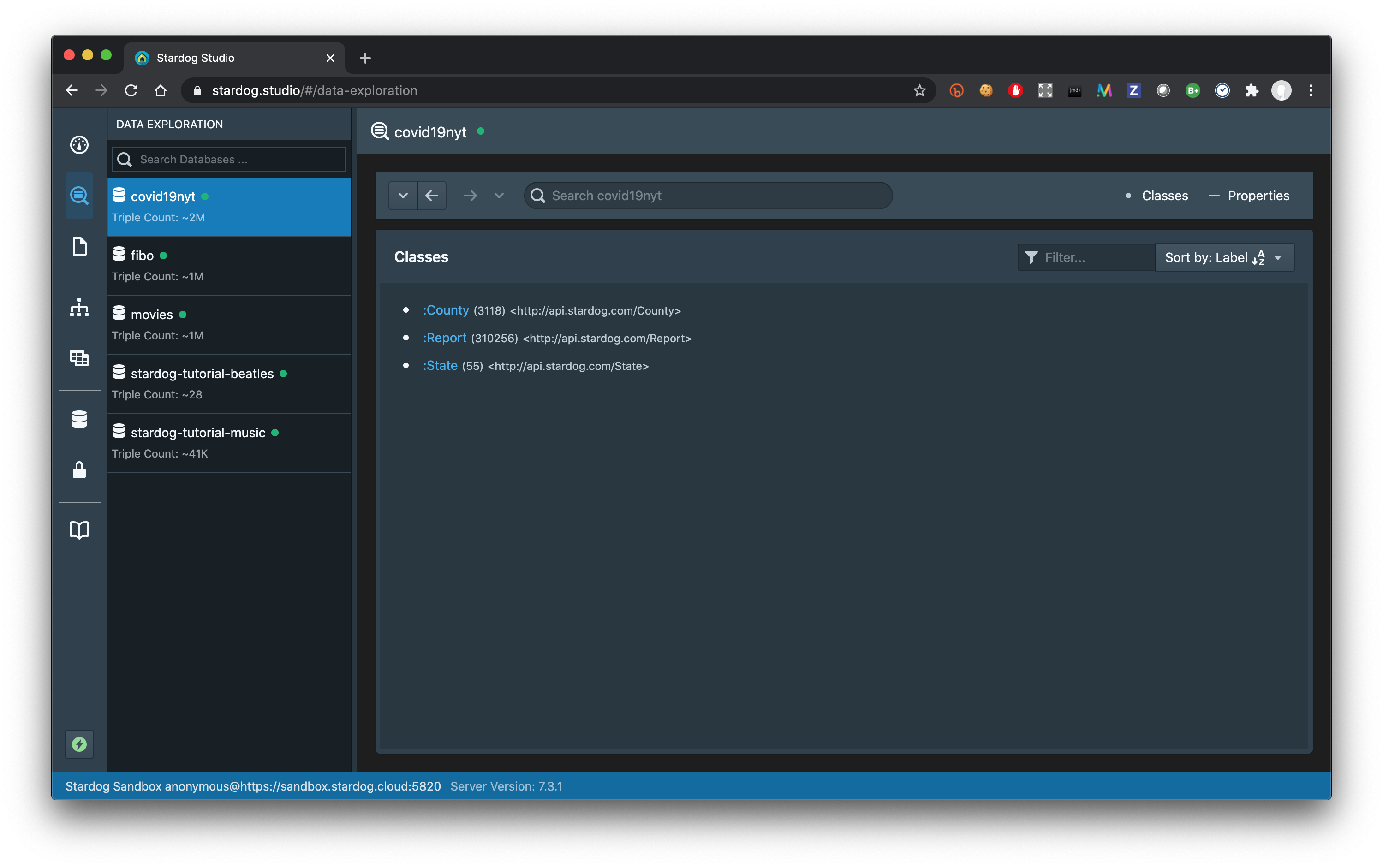
One thing you might notice right away in this view is that there are 55 states in this dataset! This is because US territories are represented as states in the original data. (See the detailed explanation of methodology and definitions NYT provides for the original dataset.)
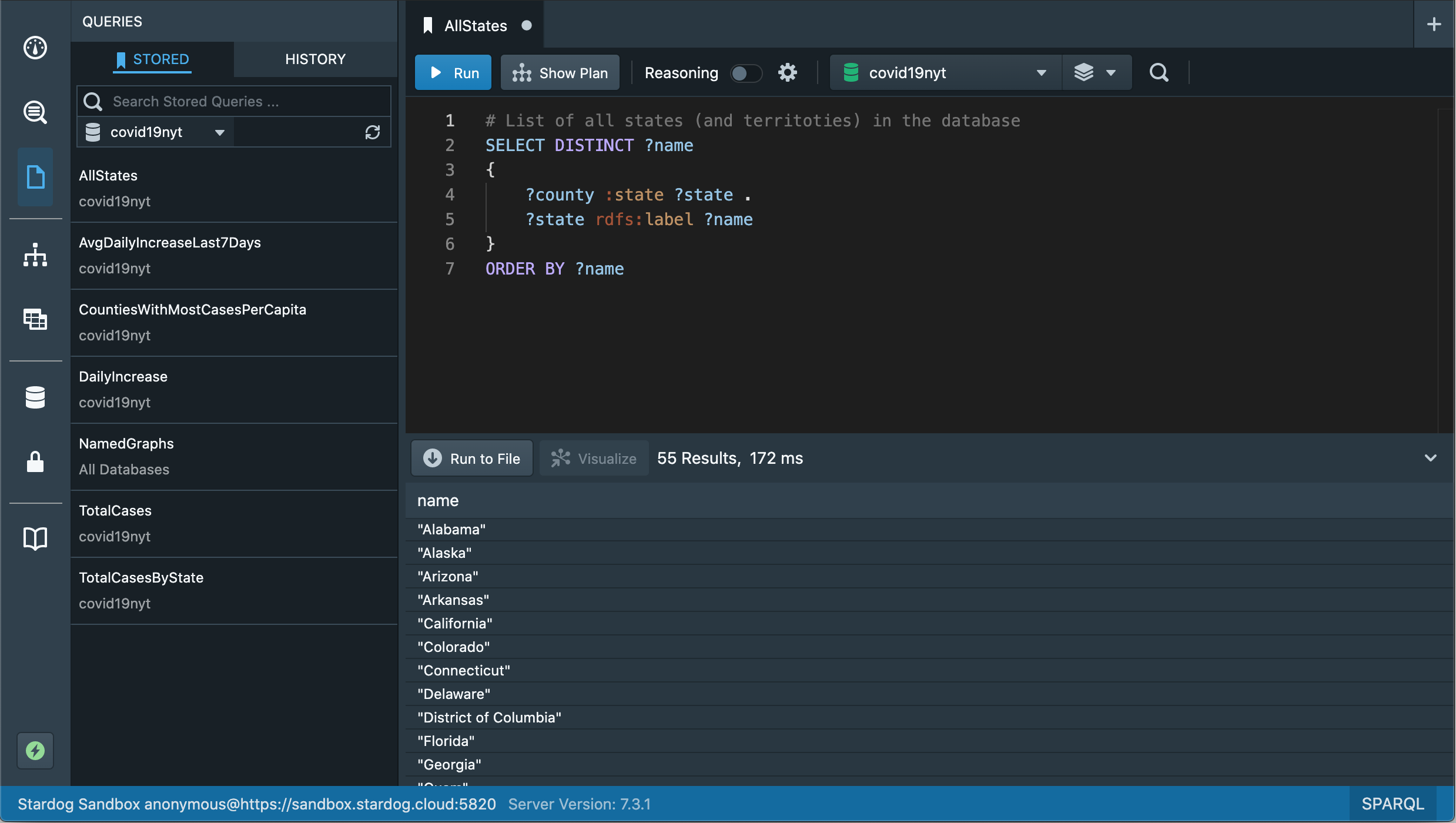
We can also write a simple SPARQL query to get the same information. You can switch to the query editor view, filter the stored queries on the left by database covid19nyt, select the stored query AllStates and click “Run” to execute the query that will return this information:
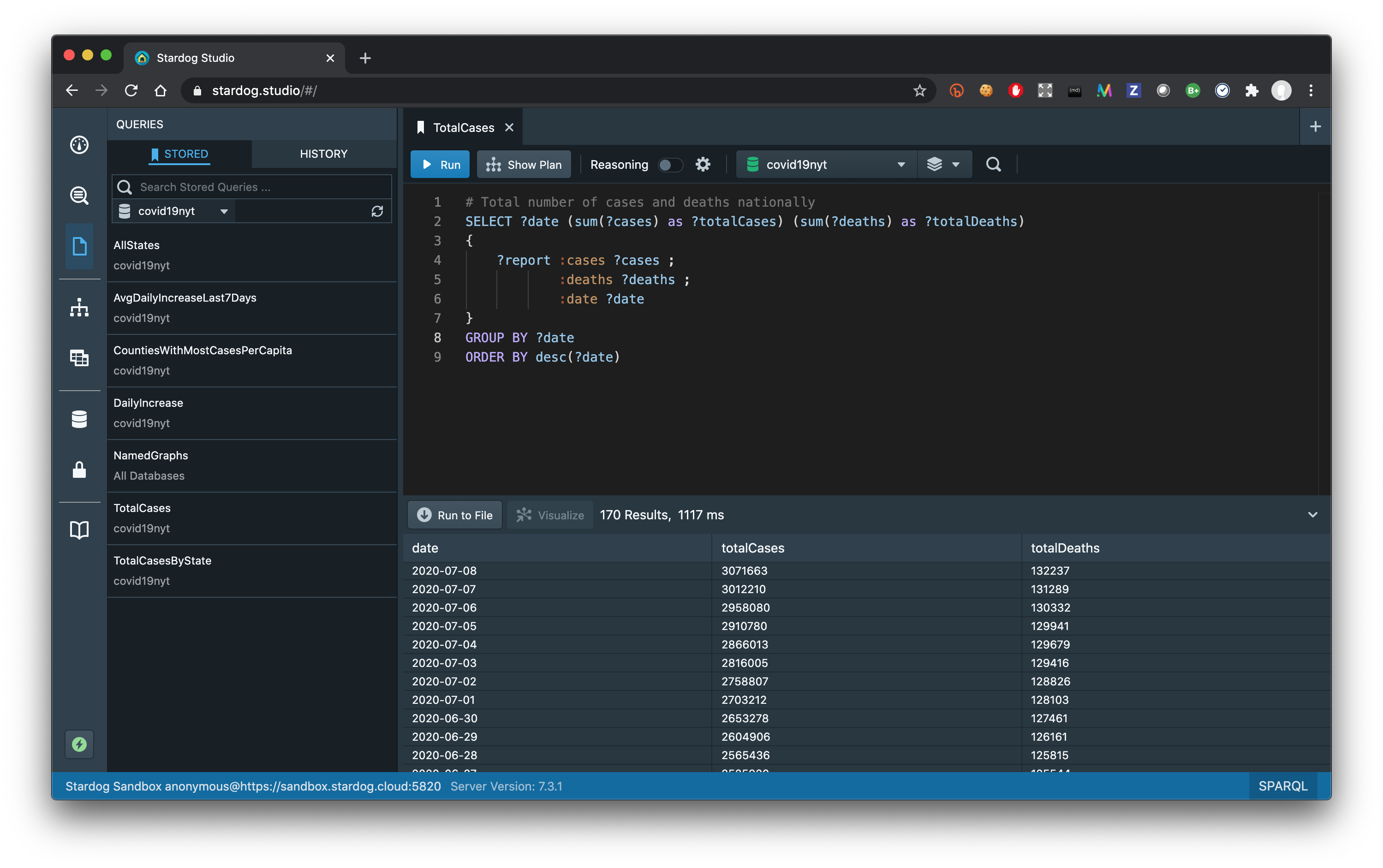
SPARQL is a very expressive query language with many syntactic features similar to SQL so you can run queries to compute different aggregations and statistics. Getting the total number of cases and deaths nationally for each date is relatively straight-forward:
If you want to get the average daily increase in cases for the last 7 days computed for each state then the SPARQL query will unavoidably get more complex. We have already provided such queries in the Sandbox:
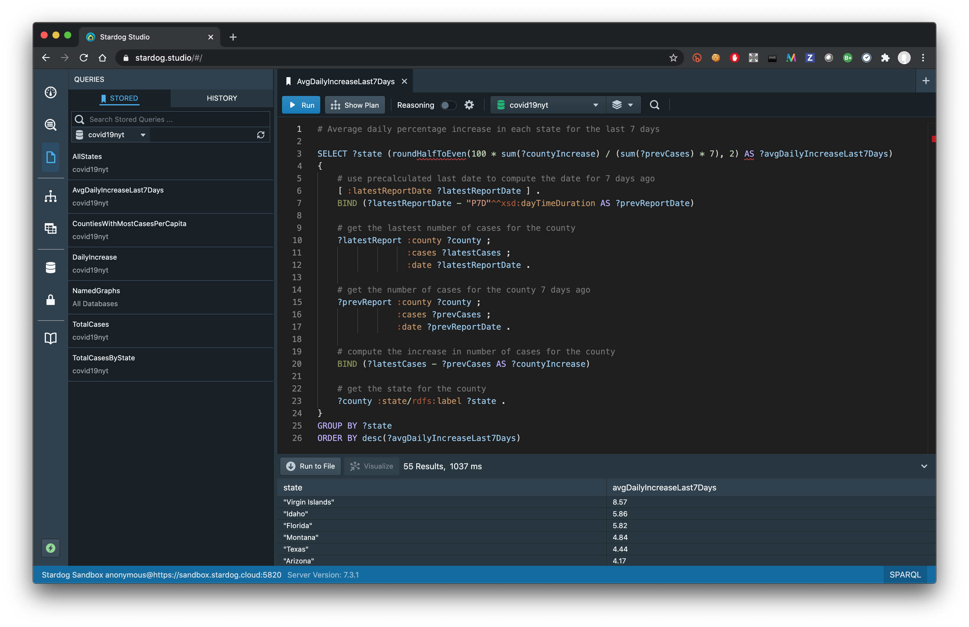
The results show states like Florida, Texas, and Arizona that have been frequently in the news recently along with states and territories with small populations where percentage increase might be misleading.
You can try to come up with your version of these queries to test your SPARQL knowledge or try to answer other questions that you might think of. Feel free to start a conversation at Stardog Community if you have questions or comments about the stored queries or if you get stuck writing your own queries.
Connecting graphs
Admittedly turning a single CSV table into a graph is not very interesting by itself. It serves as a self-contained testbed for improving your SPARQL skills, but the power of the graphs is highlighted when we start connecting multiple datasets. Connecting various sources is much easier to do with graphs especially given the built-in federation capabilities in the SPARQL query language.
Many questions that you might be interested about the COVID-19 cases will require additional information that does not exist in this simple dataset. For example, one question we were interested about was how the number of cases per capita looked for counties. The NYT dataset does not contain population information but luckily there is Wikidata. Wikidata is the central storage for the structured data of many Wikimedia projects including Wikipedia and provides a SPARQL query endpoint that we can query remotely to join that information with our dataset.
NYT datasets provides the FIPS codes for each county so we can look those codes up in Wikidata to find the corresponding county and its population and avoid unreliable text-based methods. Wikidata can be hard to use for newcomers since there is a very large number of classes and relationships and encoded numeric IRIs are used to identify these terms. But a quick search in Wikidata site helps us find the properties that correspond to FIPS codes and population and we can write the following query to answer our question:
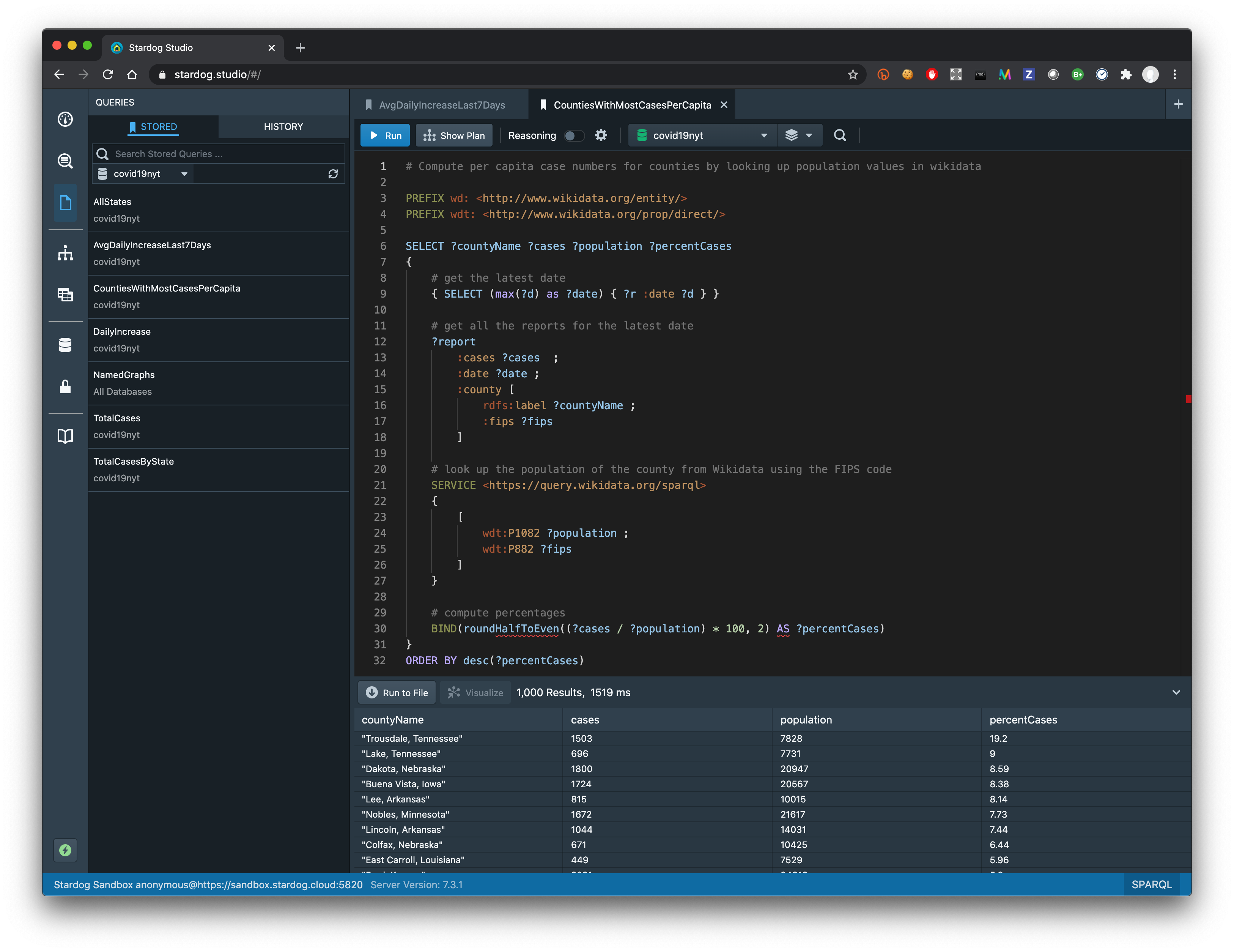
This is where the results might be surprising as you might not have expected Trousdale, Tennessee or Dakota, Nebraska to show up at the top of the list. But when you look into the counties at the top of the list you will actually discover that there is either a large correctional facility in that county, as in Trousdale, TN, or a meat-packing facility, as in in Dakota, NE, where an outbreak has occurred. You might have heard on the news about the general problems in these two kinds of facilities and with one simple query we can see how the actual numbers reflect this reality.
Visualizing results
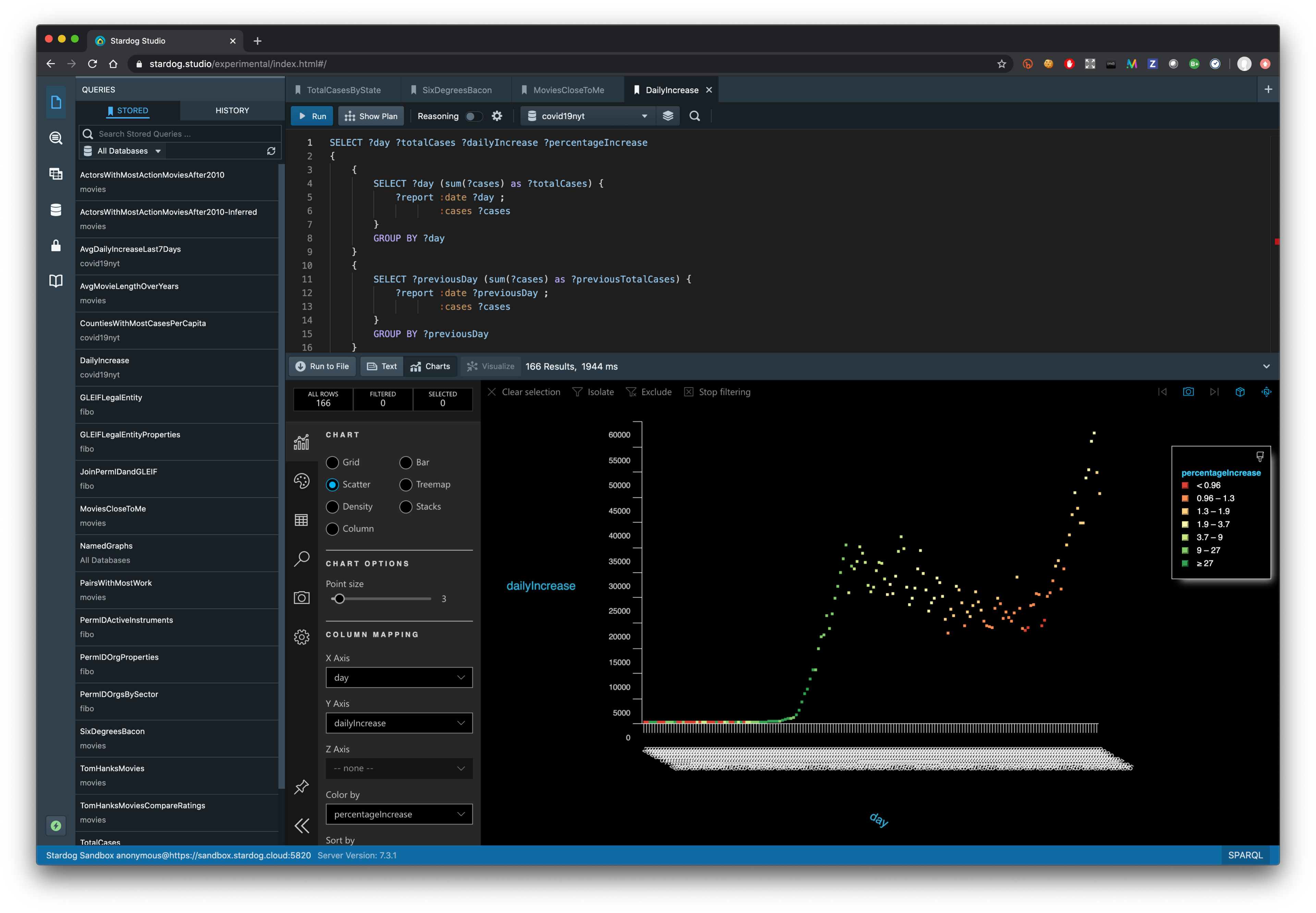
Looking at tabular results is not very informative and it is not easy to see the trends by inspecting a table of results. There are various ways to visualize query results and one easy thing you can try is to use the experimental version of Stardog Studio to connect to the Sandbox. You can run the stored queries with this version of Studio in a similar way but there is an additional tab “Charts” for visualizing query results.
Run the stored query “DailyIncrease” in the experimental Studio version, switch to the “Charts” view, select “Scatter” plot and change the X-axis to use “day” variable. You will see the following plot which you are probably already familiar with showing how the number of COVID-19 cases started going down and then spiked to new records recently:
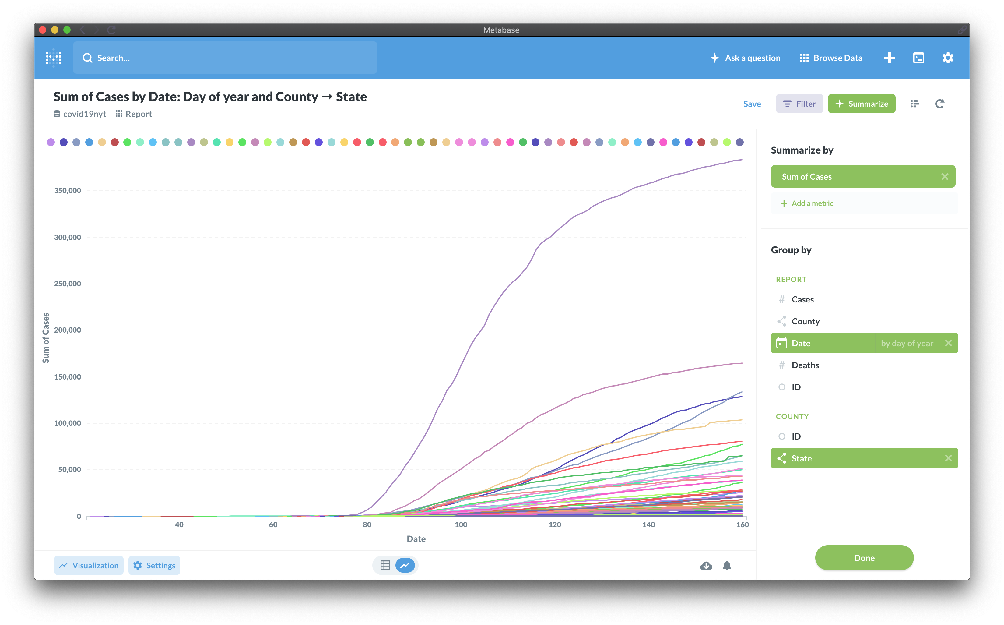
Charts functionality in Studio can be quite useful but you might also want to use BI tools that you are more familiar with. And as much as writing SPARQL is fun (for some of us) it would be better not to write these queries manually, but use existing functionalities provided by BI tools. Stardog provides out-of-the-box connectivity with existing BI/SQL tools.
The BI connectivity functionality is not yet exposed in the Sandbox but you can install a trial version of Stardog (or take advantage of the extended academic trial option) and try this functionality. You can use a commercial BI tool like Tableau or PowerBI or go with an open-source option like Metabase. You can create different kinds of charts and dashboards powered by Stardog.
Try it out!
You can explore the COVID-19 dataset (or other datasets) in Stardog Sandbox free of charge and try your own queries. The COVID-19 graph is updated daily so you will always see the most up-to-date information in the graph. Join the Stardog Community if you would like to share feedback about this graph or Stardog Sandbox in general.
Keep Reading:

Introducing Plan Endpoint
When it comes to languages for querying databases, they tend to look more human-readable than a typical programming language. SPARQL, as well as SQL, employs declarative approach, allowing to describe what data needs to be retrieved without burdening the user with minutiae of how to do it. Besides being easier on the eyes, this leaves a DBMS free to choose the way it executes queries. And as is typical for database management systems, Stardog has its own internal representation for SPARQL queries: the query plan.
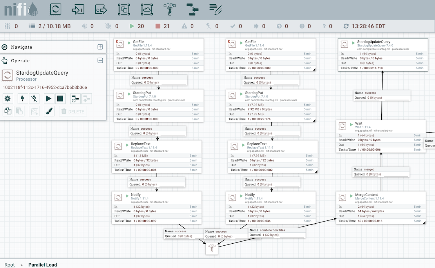
Stardog Data Flow Automation with NiFi
We are happy to announce a new feature that enhances your ability to load data into Stardog’s graph database with the release of Nifi support in v7.4.
Try Stardog Free
Stardog is available for free for your academic and research projects! Get started today.
Download now